
When you run a report in your TripWorks dashboard, you may notice some cells highlighted in red or green. This color coding indicates those values being higher (green) or lower (red) than the average of all values displayed within that same column for the date ranges of your report.
The farther a value deviates from the column average, the darker the red or green highlighting will appear. Colors indicate the following:
Light green if 120% - 150% of average |
Light red if 60% - 80% of average |
Dark green if over 150% of average |
Dark red if 0% - 60% of average |
Example
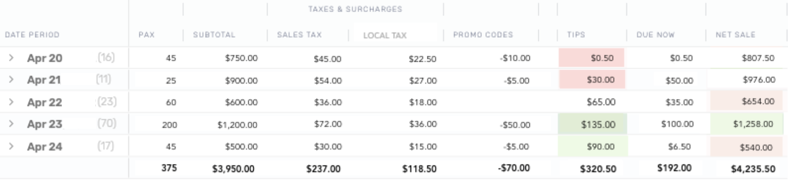
The above screenshot shows a Sales Summary Report for the dates of April 20th - 24th. If we focus on the Tips column, we see that the total amount of tips received during that timeframe is $320.50. When we divide that total by the number of rows (or days) in our report, we learn that our average tips earned for this particular date range is $64.10. Since the $65.00 of tips received on April 22nd is the only value that falls within 80% - 120% of the average, it is the only item not highlighted in red or green.
The same concepts apply to the Net Sale column, which has an average value of $847.10.